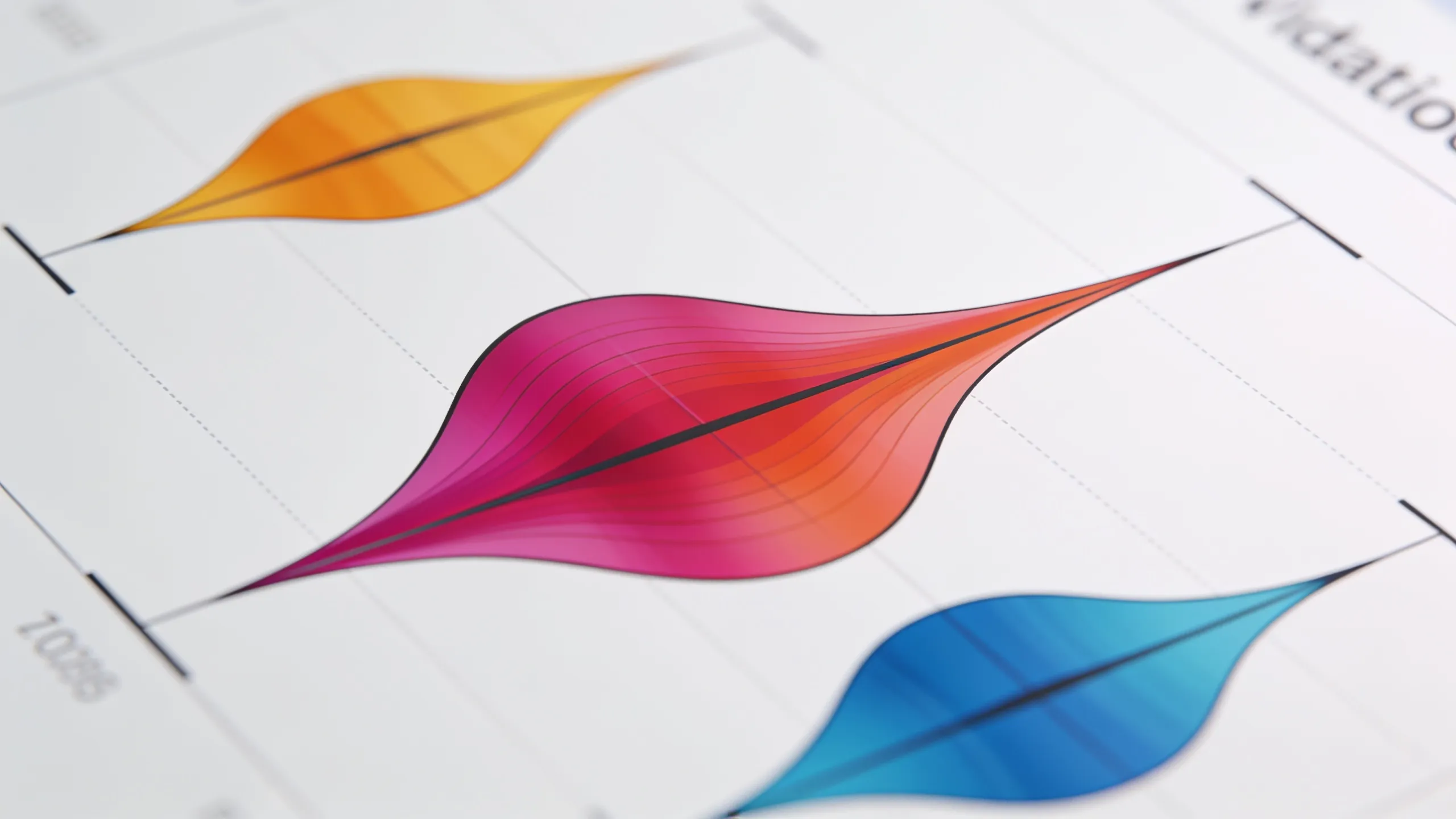
Violin plots serve as a powerful tool for visualizing the distribution of data across different categories. Unlike traditional box plots, which merely summarize the data, violin plots provide a richer insight by illustrating the density of the data at different values. This dual representation of data can reveal nuances that would otherwise be hidden. By examining a violin plot, one can quickly grasp the central tendency, spread, and potential multimodality of the dataset.
The core components of a violin plot include the kernel density estimation, which is a method for estimating the probability density function of a random variable. This density estimation is what gives the violin its shape, allowing for an intuitive understanding of the data distribution. Violin plots are particularly useful when comparing multiple groups, as they allow for easy visual comparison of distributions side by side.
When implementing violin plots, it’s essential to consider the choice of bandwidth in the kernel density estimation. The bandwidth controls the smoothness of the estimated density. A smaller bandwidth may lead to a more jagged representation, while a larger bandwidth smooths out the plot but may obscure important features. Selecting an appropriate bandwidth is important for accurately representing the underlying data.
import matplotlib.pyplot as plt
import seaborn as sns
import numpy as np

# Sample data
data = np.random.normal(loc=0, scale=1, size=100)

# Creating a violin plot
sns.violinplot(data=data)
plt.title('Violin Plot Example')
plt.show()
In this example, we use the Seaborn library, which builds on top of Matplotlib and provides a high-level interface for drawing attractive statistical graphics. When creating a violin plot, you can customize various parameters such as color, scale, and orientation. This flexibility allows you to tailor the visualization to better suit your data and audience.
Another important aspect to consider is the inclusion of additional summary statistics, such as box plots within the violins. This combination can enhance the interpretability of the plot by providing median and quartile information alongside the density estimate. The integration of these elements can lead to a more comprehensive view of the data.
sns.violinplot(data=data, inner="box", palette="muted")
plt.title('Violin Plot with Box Plot')
plt.show()
By layering a box plot inside the violin, we gain immediate insights into the data’s central tendency and spread, while still benefiting from the detailed density estimation provided by the violin itself. This technique is particularly useful when dealing with large datasets where understanding the distribution is paramount.
Moreover, violin plots can also be extended to represent multiple groups. This is particularly valuable in comparative analyses where you want to discern differences in distributions across categories. In such cases, the separation of violins for each group allows for easy visual interpretation of how the distributions overlap or diverge.
# Sample data for multiple groups
data_group1 = np.random.normal(loc=0, scale=1, size=100)
data_group2 = np.random.normal(loc=1, scale=1.5, size=100)

# Creating a violin plot for multiple groups
sns.violinplot(data=[data_group1, data_group2], inner="quartile")
plt.title('Violin Plot for Multiple Groups')
plt.xticks([0, 1], ['Group 1', 'Group 2'])
plt.show()
As we can see in this example, the distinct shapes of the violins provide a clear visual representation of the differences between the two groups. This capability to visualize multiple distributions at the same time is what makes violin plots a preferred choice for many data scientists and analysts.
When integrating violin plots into your data visualization toolkit, remember that the effectiveness of any visualization rests on its ability to communicate insight clearly. The choice of colors, scales, and additional elements should enhance understanding rather than complicate the visual narrative. Thus, a careful approach to design is essential in ensuring that your visualizations are as informative as they’re appealing.


Visa Virtual eGift Card - $25 (plus $3.95 Purchase Fee) | For Online Use Only
$28.95 (as of July 3, 2026 03:56 GMT +00:00 - More infoProduct prices and availability are accurate as of the date/time indicated and are subject to change. Any price and availability information displayed on [relevant Amazon Site(s), as applicable] at the time of purchase will apply to the purchase of this product.)Implementing violin plots in your data visualization toolkit
To further enhance your violin plots, consider incorporating interactive elements, especially when working with web-based visualizations. Libraries such as Plotly and Bokeh allow for the creation of interactive plots that let users explore data in greater depth. This interactivity can be particularly beneficial when presenting complex datasets, enabling viewers to hover over points for additional information or zoom in on specific areas of interest.
import plotly.express as px
import pandas as pd

# Sample data for Plotly
df = pd.DataFrame({
    "Group": ["Group 1"] * 100 + ["Group 2"] * 100,
    "Value": np.concatenate([data_group1, data_group2])
})

# Creating an interactive violin plot
fig = px.violin(df, y="Value", x="Group", box=True, points="all")
fig.update_layout(title='Interactive Violin Plot for Multiple Groups')
fig.show()
This example demonstrates how to create an interactive violin plot using Plotly, which allows users to engage with the data dynamically. The box=True parameter integrates box plot elements within the violin, providing a comprehensive view of the data distribution while allowing for user interaction.
In addition to interactivity, consider the context in which the violin plots will be presented. The audience’s familiarity with the data and the specific insights you wish to convey should guide your visualization choices. For instance, if presenting to a non-technical audience, simplifying the plot by avoiding excessive detail can help maintain focus on the key insights without overwhelming the viewer.
# Simplified example for a non-technical audience
sns.violinplot(data=[data_group1, data_group2], inner=None)
plt.title('Simplified Violin Plot for Presentation')
plt.xticks([0, 1], ['Group 1', 'Group 2'])
plt.show()
By removing the inner elements, we streamline the visualization, making it easier for the audience to grasp the overall distribution without getting lost in the details. This approach highlights the essential differences between the groups while maintaining clarity.
Finally, always validate your visualizations against the underlying data. Ensure that the representations accurately reflect the distributions and that any conclusions drawn from them are supported by the data. Misleading visualizations can lead to incorrect interpretations, which can have significant consequences in data-driven decision-making.
# Validation step
import scipy.stats as stats

# Checking normality of the two groups
k2, p = stats.normaltest(data_group1)
print("Group 1 normality test p-value:", p)

k2, p = stats.normaltest(data_group2)
print("Group 2 normality test p-value:", p)
By performing statistical tests, such as the normality test shown above, you can substantiate the claims made through your visualizations. This combination of visual and statistical validation creates a robust framework for data analysis, ensuring that the insights derived are both clear and credible.

![Monty Python's Life of Brian (The Criterion Collection) [4K UHD]](https://www.pythonlore.com/wp-content/uploads/2026/06/monty-pythons-life-of-brian-the-criterion-collection-4k-uhd-1-824x1024.webp)