Generating Violin Plots with matplotlib.pyplot.violinplot

Generating Violin Plots with matplotlib.pyplot.violinplot

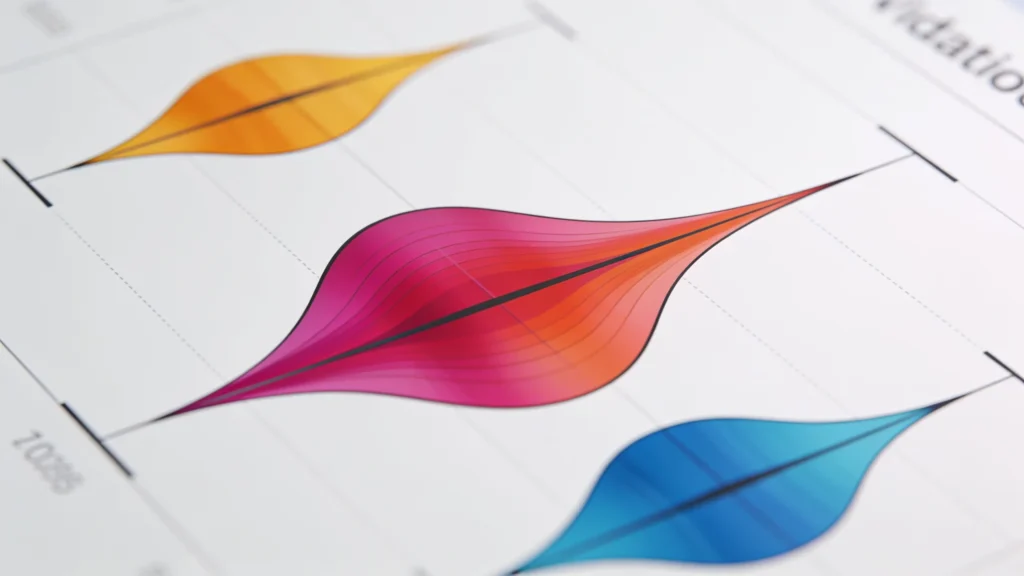
Enhance violin plots with interactive elements using libraries like Plotly and Bokeh for web-based visualizations. Create dynamic plots that allow users to engage with data, providing insights through features like hover points and zoom. Ensure audience understanding by simplifying visuals for non-technical viewers while validating data representations.
Displaying Images with matplotlib.pyplot.imshow

Displaying Images with matplotlib.pyplot.imshow

Common pitfalls in using imshow include incorrect data types, inadequate normalization, and neglecting color limits. Adjusting aspect ratios, managing transparency in RGBA images, and ensuring proper axis settings are crucial. Also, remember to label subplots and the importance of command order for saving visualizations.
Advanced Data Visualization Techniques in Matplotlib

Advanced Data Visualization Techniques in Matplotlib

Interactive visualizations in Python using ipywidgets with Matplotlib or Plotly enable dynamic data exploration through sliders, dropdowns, and buttons. These tools support adjustable parameters for 2D and 3D plots, customizable layouts with VBox and HBox, and seamless integration within Jupyter notebooks for enhanced analysis.
Customizing Ticks, Tick Labels, and Grids

Customizing Ticks, Tick Labels, and Grids

Grids enhance data representation in matplotlib plots, improving readability by providing reference systems for interpreting relationships and trends. Customize grid lines with the grid() function for color, style, and visibility on x-axis, y-axis, or both. Different grid styles for major and minor ticks offer nuanced information without cluttering the visual.
Integrating Matplotlib with Pandas for Data Visualization

Integrating Matplotlib with Pandas for Data Visualization

Matplotlib offers extensive customization options for enhancing plots. Key features include adding titles and labels, modifying line styles and colors, and customizing legends. Create subplots for complex visualizations, improve readability with ticks and grid lines, and save plots using the savefig() method. Refine visualizations to meet specific needs.
Creating Stacked Bar Charts with matplotlib.pyplot.bar

Creating Stacked Bar Charts with matplotlib.pyplot.bar

Customization in Matplotlib charts enhances clarity and accessibility. Assign specific colors for differentiation, utilize colorblind-safe palettes, and add data labels for better readability. Adjust legend placement to avoid clutter and rotate x-axis labels for improved legibility. Consider interactive libraries like Plotly for larger datasets.