Polar coordinates offer a distinct way to represent points in a two-dimensional space, characterized by a distance from a reference point (the origin) and an angle from a reference direction (typically the positive x-axis). This representation is particularly useful in scenarios where relationships are more naturally expressed in terms of angles and distances rather than Cartesian coordinates.
A point in polar coordinates is denoted as (r, θ), where ‘r’ is the radial distance and ‘θ’ is the angular coordinate. The relationship between polar and Cartesian coordinates can be established using the following equations:
x = r * cos(θ)
y = r * sin(θ)
Conversely, to convert from Cartesian to polar coordinates, you can use:
r = sqrt(x^2 + y^2)
θ = atan2(y, x)
Understanding these relationships allows you to visualize data in a way that aligns with the natural structures of that data. For example, if you’re plotting points that have a clear circular or radial relationship, polar coordinates can simplify the representation significantly.
In the context of programming, particularly with Python, the ‘math’ module provides functions essential for these conversions. To get started with polar coordinates, consider the following code snippet that demonstrates how to calculate both Cartesian and polar coordinates:
import math

def cartesian_to_polar(x, y):
    r = math.sqrt(x**2 + y**2)
    theta = math.atan2(y, x)
    return r, theta

def polar_to_cartesian(r, theta):
    x = r * math.cos(theta)
    y = r * math.sin(theta)
    return x, y

# Example usage
x, y = 3, 4
r, theta = cartesian_to_polar(x, y)
print(f"Polar coordinates: r={r}, θ={theta}")

r, theta = 5, math.pi/4
x, y = polar_to_cartesian(r, theta)
print(f"Cartesian coordinates: x={x}, y={y}")
With this foundational understanding, you are well-equipped to delve deeper into the world of polar coordinates and their applications in data visualization and analysis. Exploring how these coordinates can be represented graphically opens up further possibilities, particularly when using libraries like matplotlib.
Next, we can explore how to create and customize polar plots using the matplotlib library. The beauty of matplotlib lies in its flexibility, so that you can easily create complex visualizations with just a few lines of code. To create a simple polar plot, you would start with the following:
import matplotlib.pyplot as plt
import numpy as np

# Define the data
theta = np.linspace(0, 2 * np.pi, 100)
r = np.sin(2 * theta)

# Create polar plot
plt.polar(theta, r)
plt.title("Simple Polar Plot")
plt.show()
This code snippet demonstrates how to generate a basic polar plot using sine wave data. The ‘np.linspace’ function generates an array of angles, while the sine function creates the corresponding radius values.
Customizing these plots can enhance clarity and aesthetics, enabling you to specify grid lines, colors, and markers. For instance, you can adjust the color and style of the plot:
plt.polar(theta, r, color='red', linestyle='--', linewidth=2)
plt.title("Customized Polar Plot")
plt.grid(True)
plt.show()
In this example, the plot is rendered with a red dashed line, enhancing visibility against the default grid background. As you explore more complex datasets, the ability to manipulate these parameters becomes increasingly valuable, enabling a clearer communication of information through visual means.
As you continue to work with polar coordinates and matplotlib, consider experimenting with different functions and styles. The more you play with the tools at your disposal, the more adept you’ll become at visualizing data in a meaningful way. The versatility of polar plotting can be particularly powerful in fields such as engineering, physics, and data science, where relationships are often more complex than simple linear models allow. By mastering these principles, you pave the way for deeper insights and more effective communication of your findings.


HP 15.6 inch Laptop, HD Touchscreen Display, AMD Ryzen 3 7320U, 8 GB RAM, 128 GB SSD, AMD Radeon Graphics, Windows 11 Home in S Mode, Natural Silver, 15- fc0099nr
7% OffCreating and customizing polar plots with matplotlib functions
Beyond basic line plots, matplotlib allows you to plot points, fill areas, and even create bar charts in polar coordinates. For instance, to plot discrete points with markers, you use the same plt.polar() function but specify a marker style:
angles = np.linspace(0, 2 * np.pi, 8, endpoint=False)
radii = np.abs(np.cos(angles) * 10)

plt.polar(angles, radii, 'o', color='purple', markersize=8)
plt.title("Polar Scatter Plot")
plt.show()
Here, eight points are plotted at intervals around the circle, each with a radius computed as the absolute cosine scaled by 10. The 'o' argument tells matplotlib to plot circular markers. Marker size and color increase the plot’s readability.
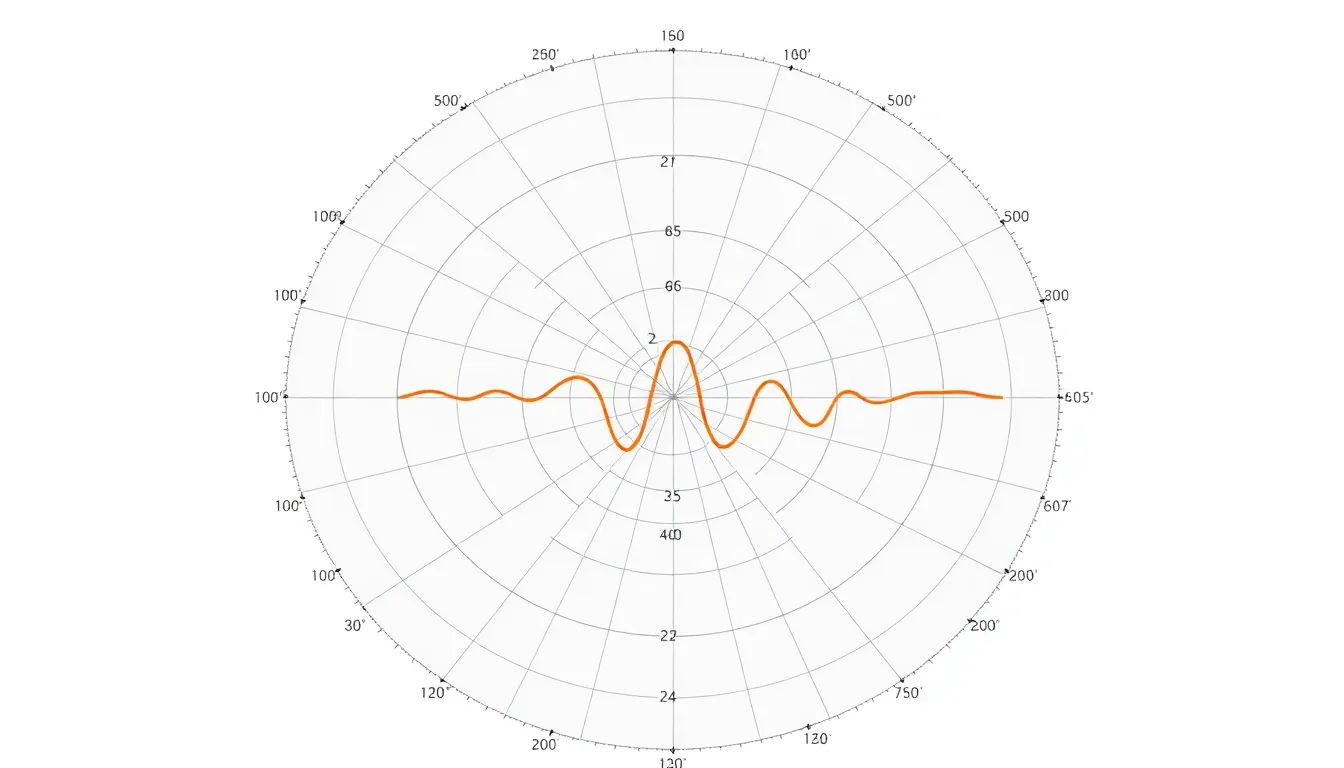
If you want to fill the area under a polar curve to highlight regions, use the fill() function. This can emphasize magnitude or thresholds in your data:
theta = np.linspace(0, 2*np.pi, 100)
r = 2 + np.sin(5*theta)

plt.figure()
ax = plt.subplot(111, projection='polar')
ax.plot(theta, r, color='teal')

ax.fill(theta, r, color='teal', alpha=0.3)
ax.set_title("Filled Polar Plot", va='bottom')
plt.show()
In this example, the curve is drawn with ax.plot(), and the area beneath it’s filled using ax.fill() with a translucent color by setting alpha. This technique makes visual distinctions clearer, especially when comparing multiple datasets.
To create bar charts on a polar axis, use ax.bar(), where each bar’s direction and length correspond to an angle and radius respectively:
num_bars = 16
angles = np.linspace(0, 2*np.pi, num_bars, endpoint=False)
radii = 10 * np.random.rand(num_bars)
width = (2*np.pi) / num_bars * 0.8  # width of each bar

plt.figure()
ax = plt.subplot(111, projection='polar')
bars = ax.bar(angles, radii, width=width, bottom=0.0, color='coral', alpha=0.7)

for r, bar in zip(radii, bars):
    bar.set_facecolor(plt.cm.viridis(r / 10))  # Color map based on height

ax.set_title("Polar Bar Chart")
plt.show()
This example generates 16 bars whose heights are random values. The bars’ colors are mapped to their height using the viridis colormap, adding an intuitive visual cue.
Matplotlib also permits direct control over gridlines, tick labels, and angles, allowing fine-tuning of what the plot communicates. For example:
ax = plt.subplot(111, projection='polar')
ax.plot(theta, r, color='navy')

# Customize angle ticks to degrees and add labels for cardinal directions
ax.set_xticks(np.pi/180. * np.linspace(0, 360, 8, endpoint=False))
ax.set_xticklabels(['0° (East)', '45° NE', '90° (North)', '135° NW', '180° (West)', '225° SW', '270° (South)', '315° SE'])

# Adjust radial limits and grid
ax.set_ylim(0, 4)
ax.grid(True, color='gray', linestyle='--', linewidth=0.5)

ax.set_title("Polar Plot with Custom Ticks and Grid")
plt.show()
Changing the tick labels helps users interpret the plot more intuitively, especially when the polar plot represents real-world orientations such as compass bearings.
Manipulating the starting angle and direction of increasing theta can also be achieved with:
ax.set_theta_zero_location("N")  # Set zero degree at North
ax.set_theta_direction(-1)       # Clockwise increase
By default, polar plots start at the positive x-axis (0 radians) and increase counterclockwise. Depending on your application (e.g., navigation or radar charts), adjusting these settings improves semantic clarity.
Combining these customization techniques results in rich, informative visualizations that bridge raw data with intuitive understanding. Mastery of matplotlib’s polar plotting functions equips you to craft presentations that communicate spatial and angular relationships effectively.