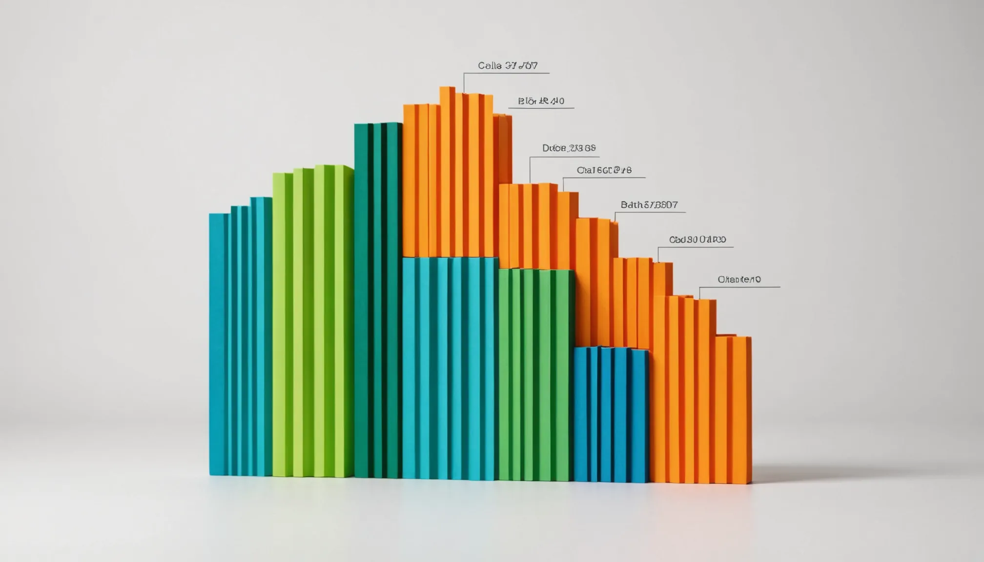
A stacked bar chart is essentially a bar chart where each bar is divided into multiple segments, each representing a distinct category or part of the whole. Instead of bars standing side-by-side, these segments are stacked on top of each other vertically (or horizontally), making it easier to see the cumulative total and the contribution of each subgroup within that total.
One of the core uses of stacked bars is to visualize composition — how different pieces add up to a whole across multiple categories. For example, imagine tracking monthly sales by product line. Each month’s total sales show as a full bar, but the stacked segments reveal how much each product contributed. This offers immediate insight into trends or shifts within the components.
Here’s a minimal example using Python’s matplotlib to get you started. Pay attention to how the data arrays are arranged and how the stacking parameter works:
import matplotlib.pyplot as plt

months = ['Jan', 'Feb', 'Mar', 'Apr']
product_a = [20, 35, 30, 35]
product_b = [25, 32, 34, 20]
product_c = [10, 12, 20, 25]

plt.bar(months, product_a, label='Product A')
plt.bar(months, product_b, bottom=product_a, label='Product B')
bottom_c = [a + b for a, b in zip(product_a, product_b)]
plt.bar(months, product_c, bottom=bottom_c, label='Product C')

plt.ylabel('Sales')
plt.legend()
plt.show()
Notice the bottom argument — it tells matplotlib where each new segment should begin. Without it, each series would overlap, making the chart unreadable. The trick is to cumulatively sum the values below the current one to stack properly.
Stacked bar charts can be vertical or horizontal. Switching orientation is just a matter of using plt.barh instead of plt.bar, and then adjusting labels and axis accordingly. This flexibility is handy when your category labels are long or you want to emphasize different aspects of the data.
Keep in mind that stacked bars are best when you have a reasonable number of categories. Too many segments per bar can clutter the visualization and make it hard to distinguish individual parts — especially if colors start to blend or if the segments become too thin. Clarity beats completeness.
Another subtle point: stacked bars show totals implicitly, but exact values for each segment can be tricky to extract visually. If you need precise comparisons of the subgroups across categories, consider alternative visualizations or add data labels directly on the segments.
Finally, the data preparation phase is crucial. Your data should be structured so that each category’s values align correctly with the x-axis labels. Often this means organizing your dataset in a tabular format where rows correspond to groups (e.g., months) and columns correspond to series (e.g., products). This makes stacking straightforward and error-free.
Here’s a quick example using Pandas for data prep before plotting:
import pandas as pd

data = {
    'Month': ['Jan', 'Feb', 'Mar', 'Apr'],
    'Product A': [20, 35, 30, 35],
    'Product B': [25, 32, 34, 20],
    'Product C': [10, 12, 20, 25]
}

df = pd.DataFrame(data)
df.set_index('Month', inplace=True)

# Plotting the stacked bar chart
df.plot(kind='bar', stacked=True)
plt.ylabel('Sales')
plt.show()
Using Pandas’ built-in plotting capabilities reduces boilerplate and handles the stacking logic internally, freeing you to focus on analysis rather than minutiae. However, if you want fine-grained control over colors, labels, or annotations, falling back to raw Matplotlib calls is still the way to go.
Understanding these basics forms the foundation. Once you grasp how the stacking works and how your data fits the model, you can move on to tweaking appearances to make your charts not just functional, but also visually compelling and easier to interpret. And that’s a whole other
Starbucks $10 Gift Cards (4-Pack)
$40.00 (as of December 9, 2025 08:29 GMT +00:00 - More infoProduct prices and availability are accurate as of the date/time indicated and are subject to change. Any price and availability information displayed on [relevant Amazon Site(s), as applicable] at the time of purchase will apply to the purchase of this product.)Tips for customizing your stacked bar chart appearance
Customization starts with colors. The default Matplotlib palette can be dull or repetitive, so explicitly assigning colors helps differentiate segments clearly. Use a list of colors matching your series order, and pass it via the color parameter.
colors = ['#4daf4a', '#377eb8', '#ff7f00']  # green, blue, orange
df.plot(kind='bar', stacked=True, color=colors)
plt.ylabel('Sales')
plt.show()
For accessibility and print-friendly visuals, consider colorblind-safe palettes like those from seaborn or colorcet. You can also generate palettes dynamically:
import seaborn as sns

palette = sns.color_palette("muted", n_colors=df.shape[1])
df.plot(kind='bar', stacked=True, color=palette)
plt.show()
Adding data labels on each segment removes ambiguity and makes the chart easier to read at a glance. Since Matplotlib doesn’t do this automatically for stacked bars, you need to calculate the position for each label manually.
import numpy as np

fig, ax = plt.subplots()
bars = []
bottom = np.zeros(len(df))

for col, color in zip(df.columns, colors):
    bar = ax.bar(df.index, df[col], bottom=bottom, label=col, color=color)
    for rect, val, bot in zip(bar, df[col], bottom):
        height = rect.get_height()
        if height > 0:
            ax.text(rect.get_x() + rect.get_width() / 2, bot + height / 2,
                    f'{val}', ha='center', va='center', fontsize=8, color='white')
    bottom += df[col].values
ax.legend()
plt.show()
Notice how the bottom array tracks the cumulative height, ensuring labels appear centered within each segment. Adjust font size and color depending on your background for readability.
Legend placement can clutter your chart if left in the default position. Use loc and bbox_to_anchor to position the legend outside the plot area or in a corner where it doesn’t overlap data.
df.plot(kind='bar', stacked=True, color=colors)
plt.ylabel('Sales')
plt.legend(loc='upper left', bbox_to_anchor=(1,1))
plt.tight_layout()  # Adjust plot area to accommodate legend
plt.show()
When you have many categories or long labels, rotating the x-axis tick labels improves legibility.
df.plot(kind='bar', stacked=True, color=colors)
plt.xticks(rotation=45, ha='right')
plt.tight_layout()
plt.show()
For horizontal stacked bars, switch to kind='barh' and adjust label orientation accordingly.
df.plot(kind='barh', stacked=True, color=colors)
plt.xlabel('Sales')
plt.legend(loc='lower right')
plt.tight_layout()
plt.show()
To emphasize differences or changes, you can normalize your stacked bar chart so each bar sums to 100%. This highlights relative proportions rather than absolute values.
df_norm = df.div(df.sum(axis=1), axis=0)

df_norm.plot(kind='bar', stacked=True, color=colors)
plt.ylabel('Proportion')
plt.gca().yaxis.set_major_formatter(plt.FuncFormatter(lambda y, _: f'{int(y*100)}%'))
plt.show()
Adding gridlines can improve readability, especially if your values vary widely.
df.plot(kind='bar', stacked=True, color=colors)
plt.grid(axis='y', linestyle='--', alpha=0.7)
plt.show()
Finally, when working with larger datasets, consider interactive plotting libraries like plotly or bokeh. They provide hover tooltips and zooming, which can make stacked bar charts easier to explore.
import plotly.express as px

fig = px.bar(df.reset_index(), x='Month', y=df.columns,
             title='Sales by Product',
             labels={'value':'Sales', 'Month':'Month'},
             color_discrete_sequence=colors,
             barmode='stack')

fig.show()