Posted inMatplotlib Python modules
Creating Stacked Bar Charts with matplotlib.pyplot.bar
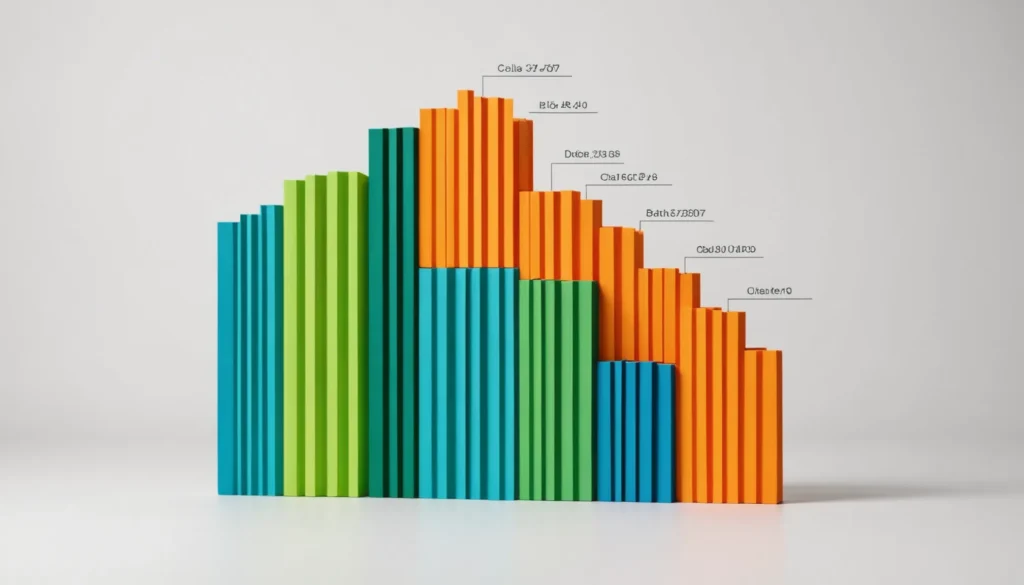
Customization in Matplotlib charts enhances clarity and accessibility. Assign specific colors for differentiation, utilize colorblind-safe palettes, and add data labels for better readability. Adjust legend placement to avoid clutter and rotate x-axis labels for improved legibility. Consider interactive libraries like Plotly for larger datasets.